PerformancePoint Monitoring/Analysing - Reports
In BSM we have Report Views which are not an element unto themselves but really a "sub" element who's definition resides within that of a parent element - either a KPI, Scorecard or an Objective (which is not actually an element per se). If you produce a good report view and want to reuse it, you can't. The most you can do is copy the RV definition into another place, which has the potential to become a maintenance nightmare.
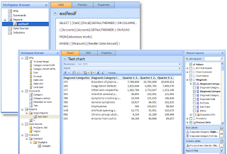
Enter PerformancePoint monitoring / analysing. PPS will give us a new first-class workspace element - the Report. Aside from our old report type favourites: OWC PivotCharts & PivotTables, spreadsheets, webpages, SSRS reports and scorecards we have several new ones.
Visio Strategy Maps
Strategy maps made a brief appearance in the original Business Scorecard Accelerator and an even briefer one in BSM as a custom report view. In PPS they're back and fully supported through the new (and more BI focused) Visio 2007.
Data Mining Trend Charts
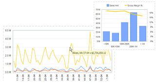
Follow a simple wizard to add some predictive analysis capability to your reports. If you've got several data points along a time line, PPS will send the data to SSAS and ask it to fill in the next n points (shown in red in the shot below) for you using the Time Series data mining algorithm. The charting engine used to display the results will still be OWC for now.
Thin OLAP Charts and Grids
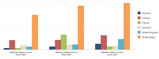
From PPS' release in Autumn (Fall) of 2007 and subsequent releases we will see more and more of that ProClarity goodness bubble to the surface. Much (if not all) of the Analyse part of the Monitor, Analyse, Plan PPS paradigm will come from the technology acquired from ProClarity. The first of we will see of this which will be thin OLAP charts and grids.
This is the stuff that will make many experienced OLAPers and MDXers stand up and cheer. These new report types will begin to make up for many of the things we wish we were able to do with OWC pivot charts and tables but couldn't. As a (very good) replacement we used reporting services but at times felt the anguish that Chris Webb has blogged about when authoring MDX-based reports in SSRS. Well no more. The thin chart & grid reports will give us:
- Drag and drop design interface
- and / or the choice to write a fully-fledged MDX query as the basis of the report data (think dynamic sets, rolling n period trends... well, anything really). Basically we will have the MDX goodness and power we always wanted but didn't have direct access to in BSM report views.

- Thin client drill up/down/across user functionality (no need for OWC on the client for these report types)
- Excel data exportability
- Customisable, CSS-based grid formatting
- Smart column header and label shortening
- Show chart data in a grid view
- Second axis series
- Combination bar/line charts
- Tooltips on data points


Those who have experience with ProClarity will see some familiar functionality here. As mentioned above the very good news is that the "analyse" part of PPS is just going to continue to get better as the product matures and grows - think of decomp trees, area charts and more. The ProClarity people are now MS people so much of the PC functionality we know and love will gradually work its way into the product. And then, of course, there is also the new stuff that they're hopefully going to build.
Now, while you're thinking about all the new & improved reports you will be able to design remember that reports in PPS will be their own element. This means that any report you design will be reusable and, most importantly, will be able to stand on its own; no more piggybacking on KPIs, scorecards etc. This now starts to blur the line between scorecarding and reporting (more of the "Analyse" and less of the "Monitor"). Think of creating a workspace with one Data Source element which connects to your cube and then just a series of report elements based on that cube. If you don't need scorecards or KPIs for a particular project you don't have to have them in order to expose data in the report elements. Then once you have defined your reports you can arrange and eventually publish them using the new Dashboard element. More about dashboard elements in another post.
Please note that all screenshots and details are based on an early build of PPS. The usual "subject to change" caveats apply.


No comments:
Post a Comment