PerformancePoint Monitoring - Analytic Charts & Grid functionality
Now we are beginning to see the ProClarity analytics stuff come bubbling to the CTP surface, and from what I understand there is more to come in the next CTP. In CTP 3 we are now given access to more fully featured (but not yet feature complete) thin client Analytic Charts and Grids.
The design experience with these two report types is simple but nice. We have drag & drop functionality which gets us part of the way there. More importantly, though, we have full access to the MDX behind the reports so we can go to town on creating some seriously dynamic content. We can either let Dashboard Designer build some MDX for us via drag & drop or we can write the whole MDX statement ourselves from scratch (or a combination of the two). Report requirements will probably dictate the approach...
What I really wanted to point out in this post is the functionality we are able to give the user via the browser with these new report types once published (particularly Grids). All users want to slice & dice (and they all just love saying "slice & dice" don't they?). Using OWC some limited interactivity was possible in BSM but it wasn't really that good, plus users had to have the OWC bits installed on their machines. Well, not any more (OWC reports are still supported in PPS, though).
Right-click is your friend
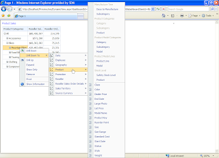
I'll let these screenshots do most of the talking here. All this functionality is thin client, delivered through the browser. A simple right-click on the appropriate dimension member exposes a huge amount of interactivity options. Drill up/down/across, expand, collapse, pivot, drillthrough ....
Selecting a dimension gives us a great view of the user-defined hierarchies and attributes contained therein. Below is a shot of a time dimension. Note the little clock icons on the dimension root and the attributes confirm that PPS is aware that we consider this a time dimension.
Here's a view of the Product dimension.
Drillthrough actions are exposed too. Not sure if all other action types are going to be supported just yet but this is a great start.
... drillthrough gives us a paged view of the granular data. Note the "Export to Excel" button in the top left too.

The PPS web parts also have a simple menu (top right of each web part) to enable the report to be shown in a New Window, so there is more room to drill, expand, collapse etc. Once users are done with their analysis, or they can't remember how they got to where they are there is a Reset View option and, naturally Export to Excel is there too.
The best part about all of this is that the work required by us to set it up is trivial. This kind of view is what I would call a launchpad report; the initial view of data is simple and compact, the user can get to just about any part of the cube they want to from that initial point.
The screenshots above were taken from a report that took me literally seconds to put together using drag & drop. [Product].[Product Categories] on rows and [Measures].[Reseller Sales Amount] and [Measures].[Reseller Order Quantity] on columns. That's it. Once this is exposed in a SharePoint via the Dashboard web part (I believe there may be specific Report and Scorecard web parts coming in the next CTP) the users can not only say "slice & dice" to their heart's content but actually do the slicing and dicing... and all with minimal dev time from us!
As a quick aside, I blame those bloody late night infomercials for the "slice & dice" thing. They started it! It all stems from those useless knife sets and chopping gizmos with stupid names presented by hosts who get dangerously excited about cutting an army boot or house brick in half. Just once in a demo I want to say "slice & dice" followed closely by "but wait, there's more!!"


No comments:
Post a Comment